Coming up with a brand identity can seem like quite a big task when starting a new business or idea. You need to consider the look and feel that you want to get across in your brand, it is more than just a logo. Think about the colour palette, the fonts you will use, alternative logo variations for different scenarios and the style of images you will have on your website and social media platforms. All these things need to work together consistently and reflect your brand values.
A great way to see how all the brand elements work together is to create a Brand Board. A brand board is a visual way of laying out all of your separate brand elements, like your logo, colour palette, logo variations, a sub-mark, fonts, imagery and patterns, on a white background to see how everything works as a unit.
An excellent source of inspiration when creating your brand board is Pinterest - this is where we turned ourselves when looking for inspiration for our brand board for the redesign of Sculpture Qode. Typing in ‘brand board’ into Pinterest search brings up so many results - you can check out our Pinterest board here to see all the brand boards we pinned.
Below are just 10 of our favourite brand boards we found on Pinterest:
1. Blush Photography - Grit & Wit
From the beautiful custom lettering in the logo, the earthy, natural colour palette, the cute hand-drawn illustrations and the quirky mix of patterns, this brand board for Blush Photography caught our eye. We also particularly like the font combination of the italic serif font with the large letter spacing on the sans serif font.
2. Jessica Olsen Photography - Rickety Robot / Audrey Elise
The first things that stood out on this brand board for Jessica Olsen Photography were the striking colour palette and the bright, eye-catching custom pattern. The logo also features a fun handwritten font and can be used in three different variations.
3. Fig & Thyme - White Oak Creative
This brand board for Fig & Thyme, a food blog, shows a sophisticated, minimal logo design, a somewhat muted, organic colour palette and patterns that consist of clean lines and tiny spots. We particularly like the rustic looking illustrations and the collection of photos that represent the brand.
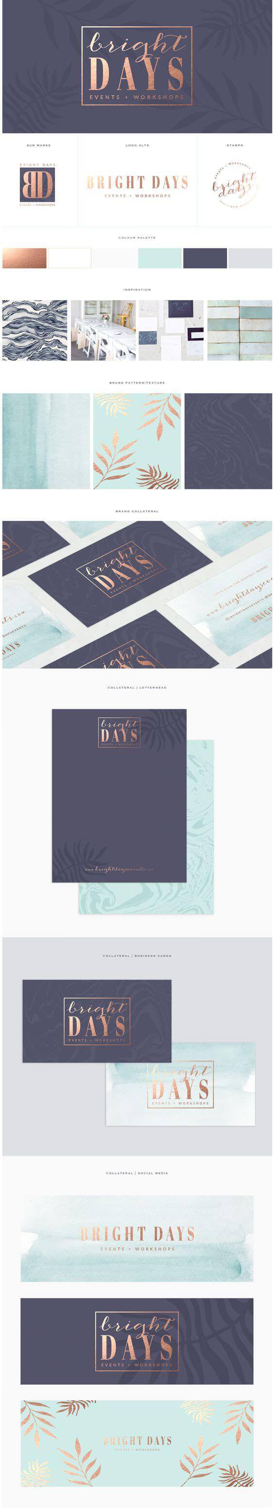
4. Bright Days - Brand Me Beautiful
The combination of the gold foil effect with the navy blue and the contrasting turquoise was what drew us to this brand board for Bright Days Events. There is an excellent mix of logo variations and some lovely stationary mockups showcasing the logo and beautiful, subtle background patterns.
5. Shadi Boulos - Salted Ink
This brand board for photographer Shadi Boulos has a more masculine style than some of the other brand boards on this list, with a very natural, warm and earthy colour palette, and the use of the grey and beige, subtle patterns. The hand-drawn font used for the logo makes the brand come across as personal and approachable.
6. St. Vincent’s of Chelsea - Trudy Georgina
The bold, dark brush lettering used for the logo font, with the vivid red and aqua that contrast vividly with the brush black and white spot pattern makes this brand board for this fictitious fine-wine company stand out for us. We also really like the geometric parakeet logo mark that combines the bright colours and spot pattern.
7. Sneaky Veg - Vicki Turner
There are so many things we love about this brand board for the Sneaky Veg blog! The colour palette is bright, bold and eye-catching, and the simple shapes that make up the little vegetable illustrations are fun and engaging, especially for children. We also get quite a retro feel when looking at this brand board - from the combination of the colours, shapes and the use of the font Futura.
8. The Baking Bird - Earl Grey Creative
Like most of the brand boards on this list, it was the bold colour palette and hand-drawn font for the logo that caught our attention with this brand board for The Baking Bird blog. Sadly no longer around, this brand identity comes across as warm and homely, precisely what you would expect from a blog all about baking and cooking!
9. Modern Boudoir - Whitney Hawkins
This brand board for Modern Boudoir oozes femininity, elegance and glamour! From the rose-gold and grey colour scheme to the beautiful script font teamed with the sophisticated serif font for the logo, and the pattern accents, everything works perfectly together to create a brand identity that represents real beauty.
10. Holly Casto Creative
Everything about this brand board for Holly Casto says ‘happy!’. The colour palette is bright and cheerful, the handwritten style typeface is friendly, and the patterns and design elements are cute and fun. We also like the inclusion of the inspiration photos on this board.